Trend Graph
How have one or more values changed across dated Excel uploads or database snapshots?
Reports
Navi includes five focused reports for understanding change over time, finding warnings and status markers, and reviewing notes. Each report can be narrowed to the information people need and exported when the result must be shared.
Five focused reports
How have one or more values changed across dated Excel uploads or database snapshots?
Which records are improving, reducing or staying similar across several saved periods?
Which records have triggered a warning, what caused it and what does the message say?
Which records carry a particular status marker, and where do those records sit in the business structure?
What notes have people added, who added them and which dashboard record does each note belong to?
Trend Graph
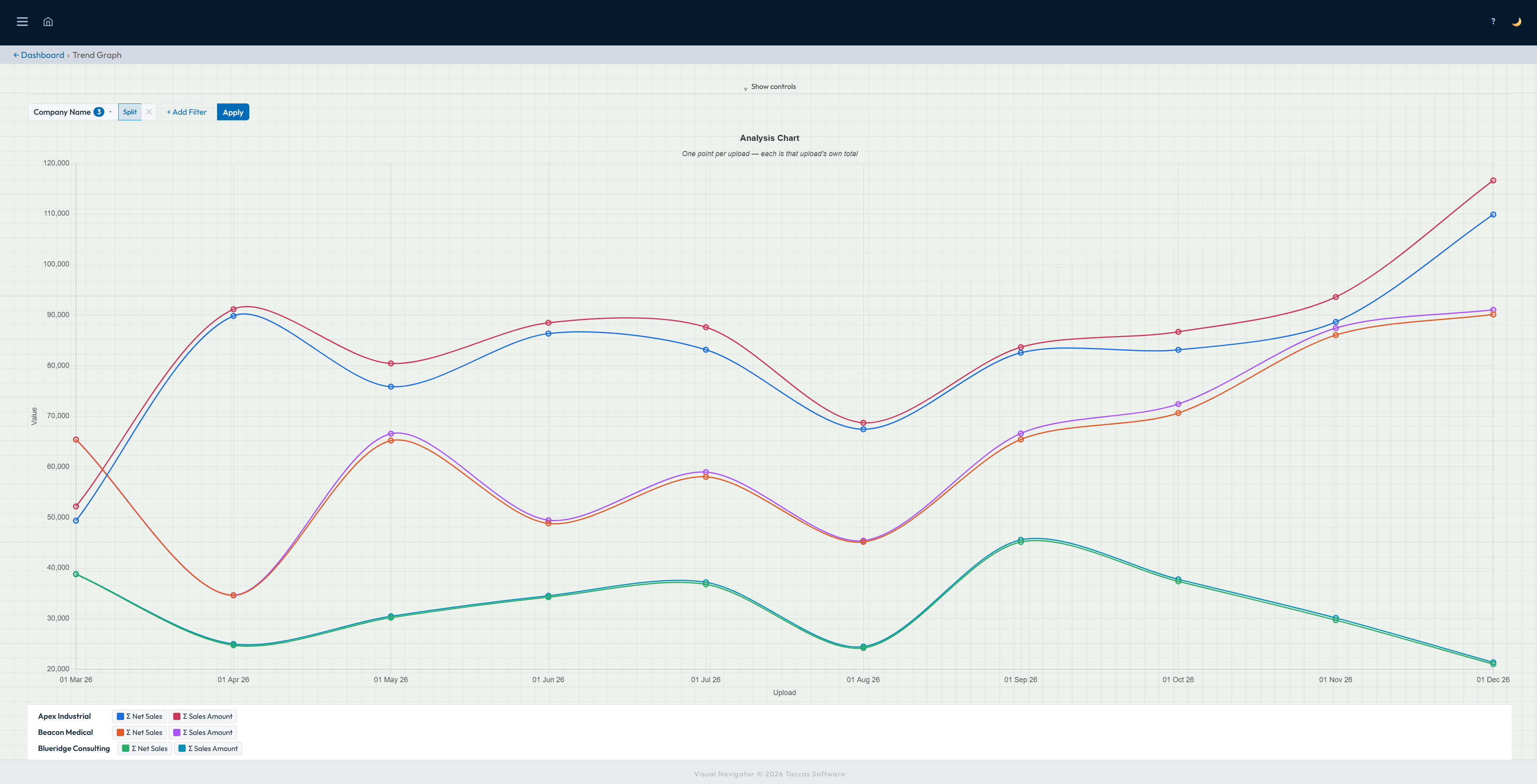
Choose a history created from dated Excel uploads or database snapshots, then choose the values you want to follow. Navi can total each value for every period or focus the graph on a selected group of records.
Choose the number of periods or a date range, narrow the records if needed and run the graph. Each point represents saved information from that date, making rises, falls and changes in direction easy to see. The result can be exported to Excel.
Data Matrices
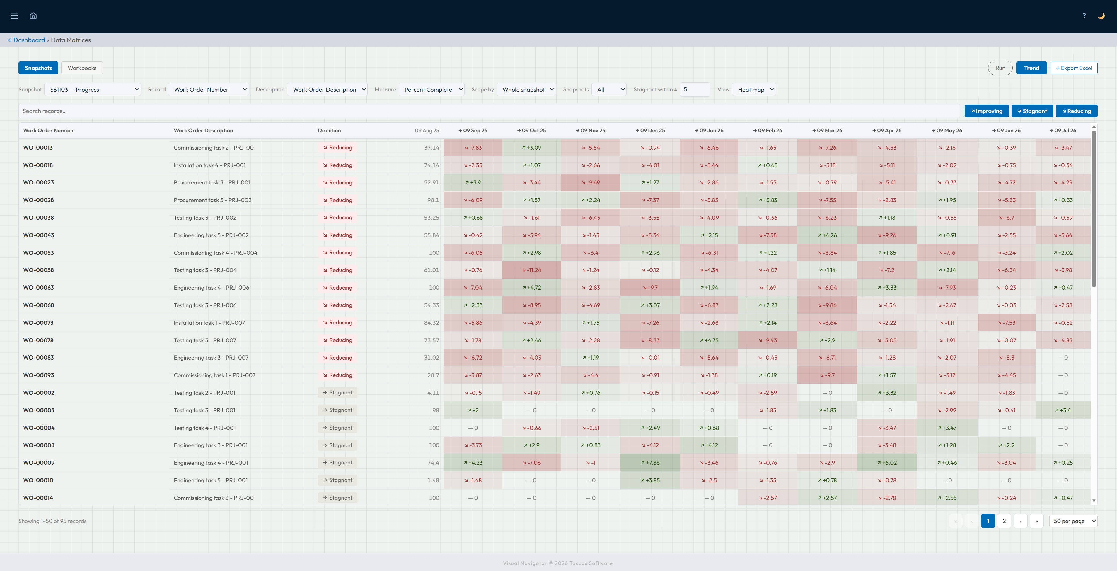
Choose history from database snapshots or Excel workbooks, then select the record name, value and saved periods you want to compare.
The matrix places records down the page and dates across it. Colour shows whether each value increased, stayed similar or reduced since the previous period, so broad patterns and individual exceptions stand out. Search, filters and Excel export help people investigate and share the result.
Alert Summary
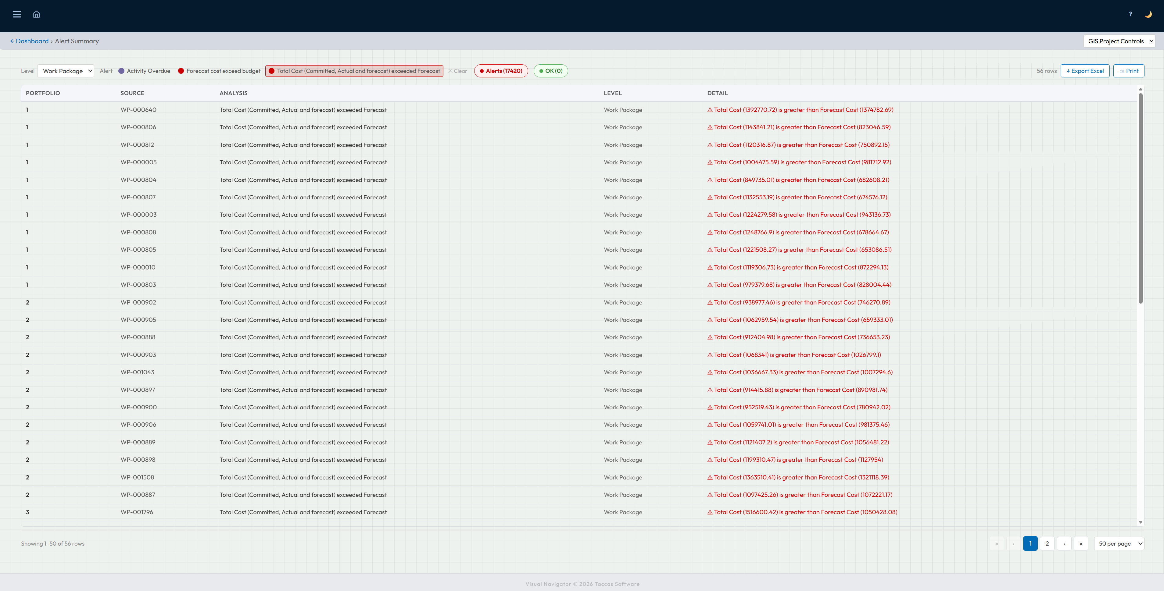
Choose the part of the business you want to review, then select one or more warning types. Navi lists every matching record and shows the dashboard it belongs to, the record reference, the warning that was triggered and the full explanation.
Switch between Alerts and OK to compare records that need attention with those that passed the same check. The result can be printed or exported to Excel, so a review meeting or follow-up list starts with the same information people see in Navi.
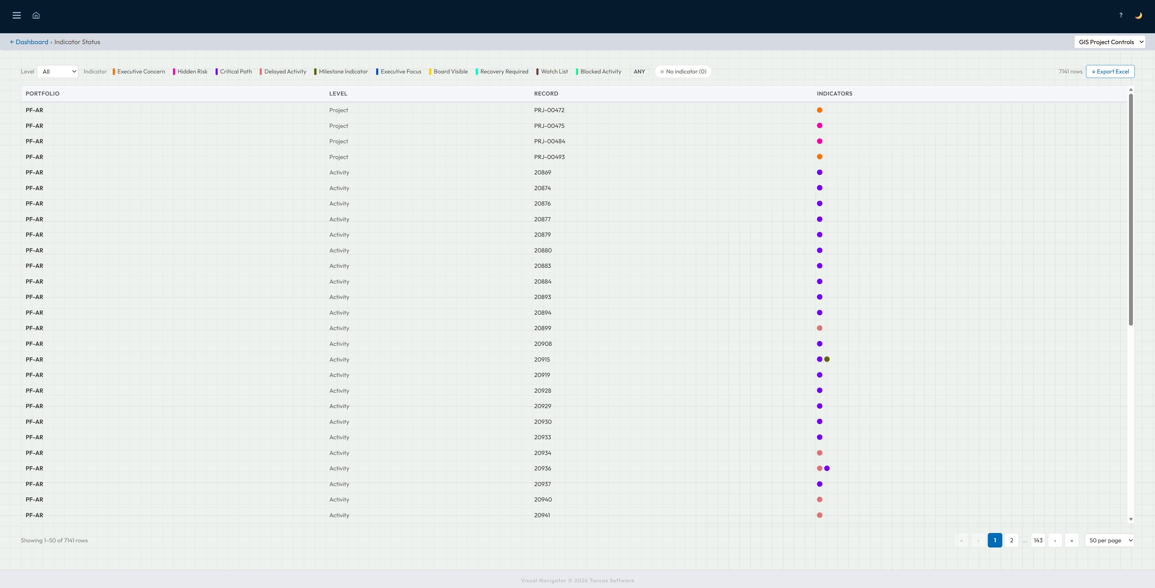
Indicator Status
Choose a business level and one or more coloured markers, or show every marker at once. The report identifies the dashboard, the type of record and the individual record, with coloured dots showing all markers attached to it.
This makes it possible to answer questions such as “show every project marked as a hidden risk” without opening tiles one by one. You can also find records with no marker and export the filtered result to Excel.
Notes List
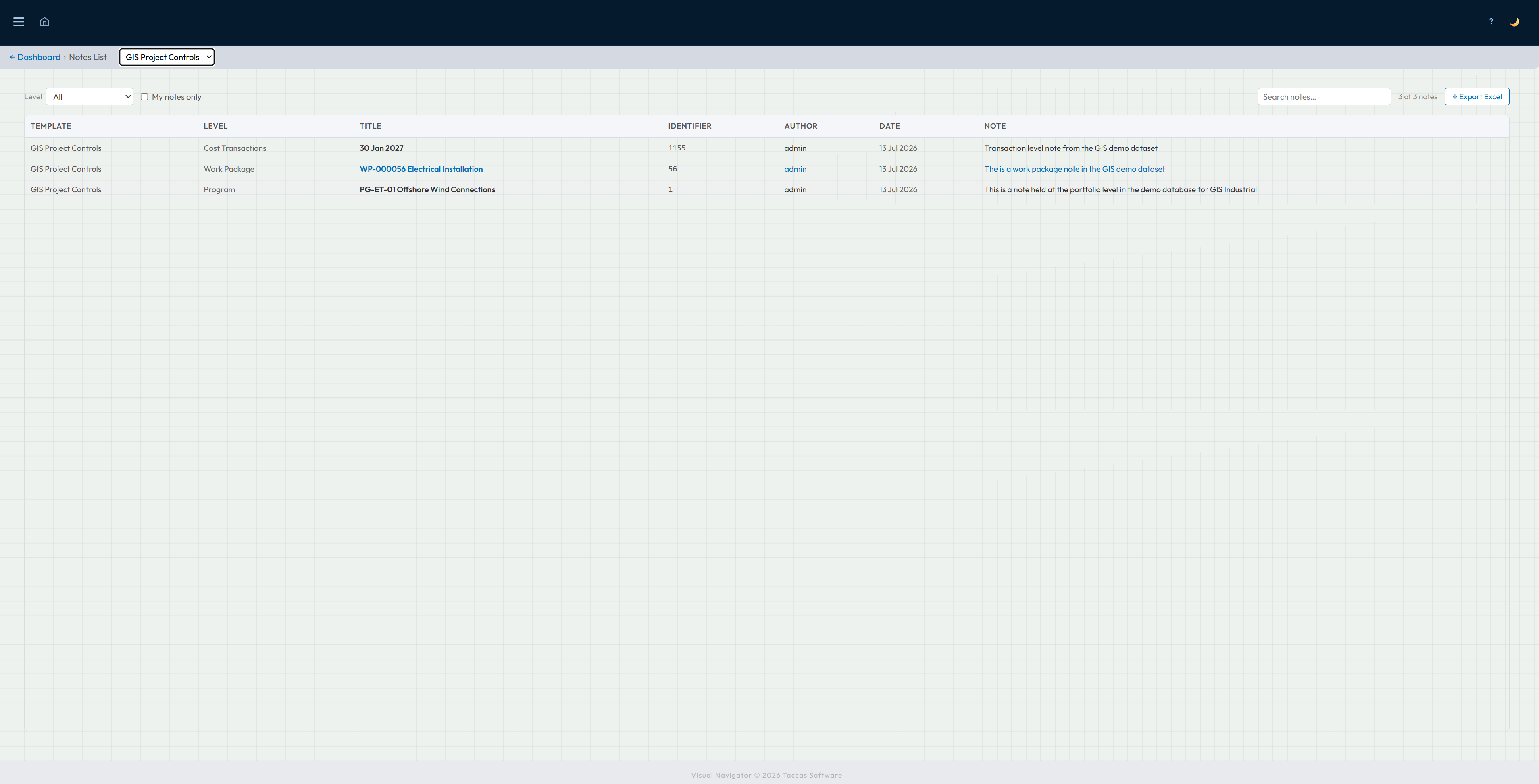
Notes List can show notes from one dashboard or all dashboards a person can access. Narrow the list by business level, show only notes you added, or search across the dashboard name, record, author, date and note text.
Each row identifies the dashboard, business level, record title and reference, who wrote the note, when it was added and the note itself. Long notes can be expanded, and the filtered list can be exported to Excel.